'So big, it's basically a Start screen again': Windows 11's new Start menu is getting some hate — and triggering Windows 8 flashbacks
- Windows 11's Start menu is receiving a mixed reaction
- Some people aren't keen on the size – though others are fine with it
- There are also complaints about a lack of customization in some respects
Windows 11's new Start menu is proving controversial as the revamped interface continues to roll out; that much is clear.
Some people are seriously unimpressed with Microsoft's overhaul here, while others are more appreciative of the redesign. And those opposing camps aside, there are other folks who are miffed about the new interface, not because they hate or like it, but because they still don't have it yet.
Windows Central pointed out a thread on Reddit, which is a great example of how polarized the debate around the new Start menu has become, where the original poster asked for "Thoughts on the new Start menu update?"
And boy, did they get some thoughts, some of which were spicy or even downright fiery.
The main complaints voiced are twofold. First, the Start menu is just too big in its new form, and second, there's a lack of customization, which hampers the panel in certain respects.
Size matters
The issue around the size of the redesigned Start menu is complicated. In the linked thread, there are multiple complaints that it's big, or huge, or indeed, as one Redditor put it, "So big, it's basically a Start screen again." This refers to the configuration of this part of the interface in Windows 8 – as the entire screen, not a menu off the taskbar – which was a move that caused a lot of hate in the Windows community at the time. (Microsoft was trying to make an OS suited to tablets and touchscreens as well as desktop PCs).
There's a similar sentiment in another Reddit thread, where someone observes: "The new Start menu is basically a second desktop."
The prevailing feeling from a fair few people is that the redesigned menu pretty much takes up the whole desktop, then, and feels suffocating as a result. And that's especially true if you have the Phone Link panel enabled, which floats off to the side, taking up more space.
However, there's a nuance here, and how big the Start menu actually is depends on the size of your screen as well as the resolution (and potentially the interface scaling). There are a few moving variables here, in short, but different Windows 11 PCs will be treated to a smaller (6-column) or larger (8-column) Start menu based on the available room to display the interface. And it's folks getting the bigger take on the UI who are complaining the most.
There are hacks to force the 6-column version to be enabled, rather than the larger variant, and that's what a lot of folks who hate the size are resorting to. (Either that, or third-party customization apps).
However, there are more than a few Windows 11 users who don't have a problem with the Start Menu (they appear to be running the 6-column version)
So, far from everyone is unhappy. However, even with the more compact layout, depending on the screen size and resolution combo, there are still folks bemoaning that there's too much wasted space here (gaps between icons and sections where the UI sizing appears to go awry).
Layout options
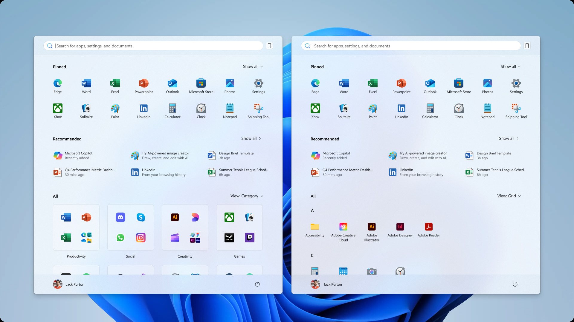
The other main beef aired across Reddit is that the Start menu doesn't offer enough customization. In fact, this has been a controversial area ever since the revamped UI was first revealed almost a year ago.
This is mostly flak being fired at the category view for the list of apps, which is a neat idea in theory in terms of making that list fit into a more organized, compact space. However, Microsoft has automated the grouping of those categories, and Windows 11 doesn't do a great job of this.
PC games-related stuff in particular can be put all over the place, and the feedback is largely negative in terms of how apps are categorized – particularly as a ton of software just gets chucked in the 'Other' category (meaning Windows doesn't have a clue where it should go).
This wouldn't be such a big issue if you could rejig all this yourself, and manually shift icons around – but you can't. There's no way to move apps to different categories, or rename categories, or indeed create new groups. People are pretty frustrated with Microsoft's decision here, and I have to agree, it seems very odd that you can't tinker around with this view.
However, there's praise for an important customization twist that is present with the new Start menu, and that's removing the section that carries Microsoft's 'recommendations' – and I fully agree that this is a very welcome touch.
Where on earth is the new Start menu?

Tellingly, the most upvoted comment in the 'thoughts' Reddit thread picked out by our sister site, Windows Central, is this: "I'll tell you my thoughts when I finally get it."
This includes me, because I don't have the revamped Start menu on my Windows 11 laptop or desktop yet. I'm not alone, as there are a surprising number of comments bemoaning that the redesigned UI hasn't arrived yet.
That's surprising, as the full rollout officially began back in November 2025, so it appears Microsoft is taking its sweet time over the deployment.
For some, then, the wait continues – and for others, their wish is that they never got the new Start menu in the first place. Maybe Microsoft will now be looking into implementing further customization, at least for that category view.
Follow TechRadar on Google News and add us as a preferred source to get our expert news, reviews, and opinion in your feeds. Make sure to click the Follow button!
And of course, you can also follow TechRadar on YouTube and TikTok for news, reviews, unboxings in video form, and get regular updates from us on WhatsApp too.
from Latest from TechRadar US in Software News https://ift.tt/dXLgnlH
via IFTTT
Comments
Post a Comment