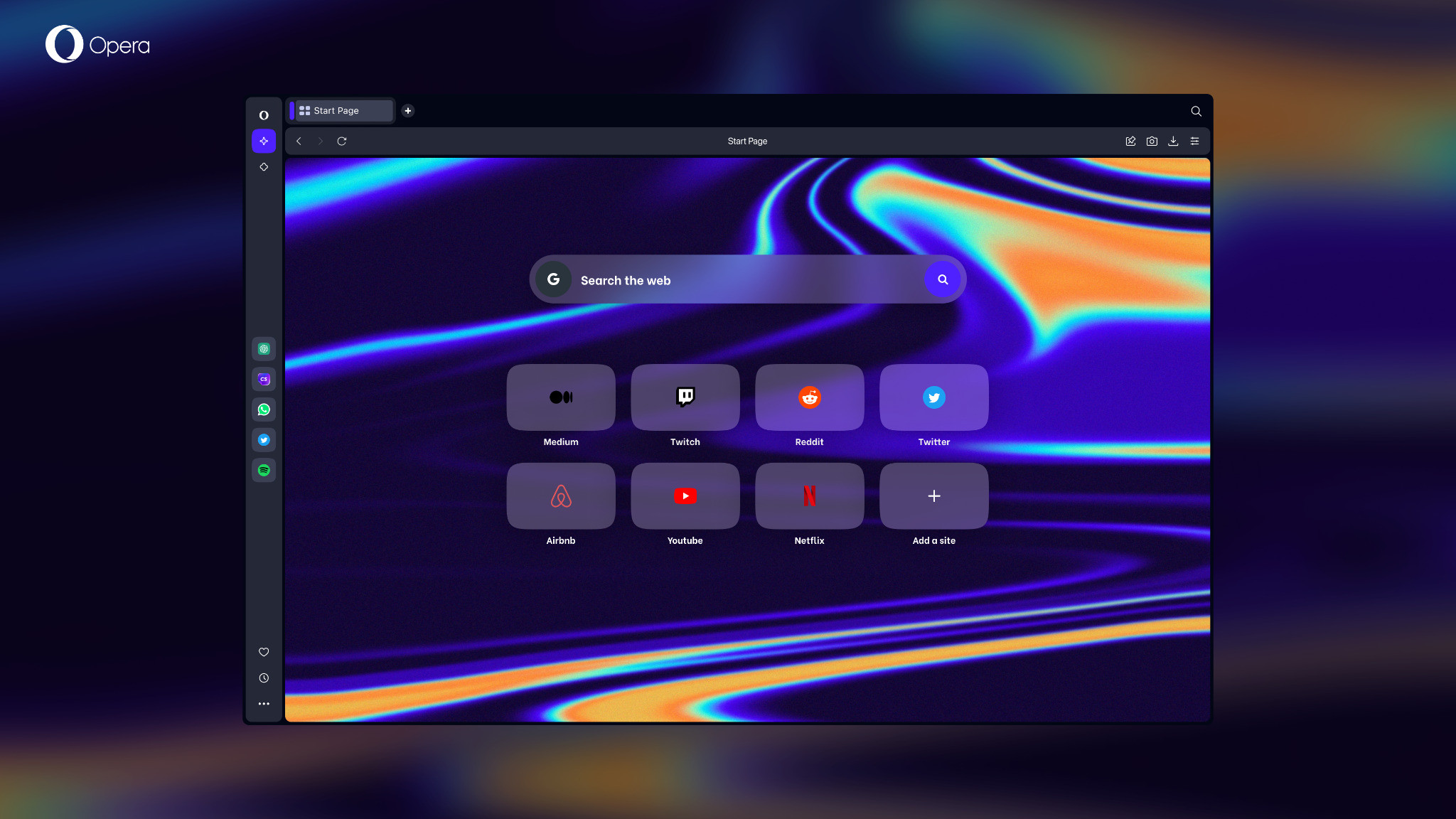
Opera One is an all-new take on Opera’s web browser which the firm describes as re-engineered and modular – while being powered up by AI.
It’s no great surprise to see AI incorporated, of course, seeing as it’s rapidly becoming a very crowded bandwagon, although the first thing to note here is that Opera One (hat tip to Google on the name, presumably) is still in development (early access at this point). Eventually, the idea is that it’ll replace the existing Opera browser.
Not only does Opera One introduce artificial intelligence into the mix, but the company notes that it’s the first Chromium-based browser to use a multithreaded compositor for the UI – plus it introduces a new feature called Tab Islands.
Okay, so let’s go through all this new stuff and exactly what it means. Firstly, you’re likely wondering exactly where AI will fit in with the revamped Opera browser.

Well, Opera will populate the sidebar with AI-powered content services, and furthermore, there’ll be some more direct integration of AI features, too. The first of which – and the only one we know about so far – will be a ‘shorten’ button in the browser’s address bar that will use AI to generate a short summary of any web page you’re looking at.
Song Lin, Co-CEO of Opera, commented: “Following the mass interest in generative AI tools, we believe it’s now time for browsers to step up and become the gateway to an AI-powered web”.
Opera One will also dynamically adapt to the needs of the user, as Ghacks reports, adjusting its interface based on what’s currently being done or viewed in the browser. The broad idea is for a modular interface that clears unneeded bits of functionality out of the way, making for a more streamlined and uncluttered experience.
Regarding the UI, as mentioned Opera One is adopting a multithreaded compositor, which is a fancy way of saying that transitions between pages and animations will be more smoothly rendered and generally better looking.
Tab Islands is a further major introduction here, which is groups of related tabs. Say you open a few different Instagram pages for example, these will automatically be grouped together (and color-coded), and if you wish, you can collapse that group to get the tabs temporarily out of the way.
They shrink down into a compact and neat vertical bar that can be clicked on to expand all the tabs again, thereby helping you manage when you have a lot of tabs open, doing all this automatically.
Analysis: Artificial opportunity?
There are some neat introductions here, then, and the broad idea is to achieve a much better-organized browsing experience – with a more streamlined and responsive interface – all infused with the power of AI.
Of course, the AI aspect is what folks will focus on as it’s very much the hot topic right now, although there isn’t much AI in here to begin with. The only feature now present in testing is that ‘shorten’ button (basically a TL;DR option at your fingertips for any web page).
The danger is that this feels a bit like Opera is seizing the opportunity to crowbar in AI as a selling point to push adoption versus its big Chromium-based rivals, Google Chrome and Microsoft Edge.
Okay, so technically Edge does have some AI features built-in already – the Image Creator in the sidebar – but Opera is clearly gunning to set up its browser with much bigger aims for AI, while Microsoft focuses more on poaching web search traffic with its Bing ChatGPT-powered AI. (And Google has Bard, of course, and a whole bunch of generative AI stuff for the likes of Gmail and Docs).
Looking at Opera One’s first big AI feature, that shorten facility, we have some concerns about that already. The way it works is to skim through the web page and provide a bullet-point summary of the content, but there are potential stumbling blocks here. As with any AI summary, how do we know just how accurate it is? Can we trust an AI to summarize without making mistakes? Perhaps, but for us, the bigger worry pertains to the possible loss of context in a summary.
Let’s remember that many websites already use TL;DR in some form – here at TechRadar, we do it upfront to provide a summary of reviews for those who aren’t interested in all the nitty-gritty details – but the difference is, that summary is compiled by the writer. Someone who knows the article inside and out, and with an AI, our concern would be that context could be twisted somehow, and there are potential ways this could go wonky.
Mistakes are more likely, as we’ve seen, in these very early days for AI, and the fear is that what’s becoming a manic rush to get AI on board everything is perhaps unwise, shall we say. Particularly when concerns are being raised from various corners about AI and inaccuracies, and the effects they may have on more impressionable folks like children for example – who may regard an AI as truthful and authoritative.
We can’t fault Opera’s ambition here, to be fair, and with the AI side of the equation, everything is really down to the implementation. Opera One will need to be built carefully, over a long period of time, we’d expect, if it really is aiming to go big on AI and avoid the inherent pitfalls.
What we don’t want is a rush for one-upmanship over Chrome and Edge in a bid for adoption, and in fairness, that goes for Microsoft’s Bing plans too, and Google’s bid to catch up to the latter with Bard (which was clearly hurried out the door, fumbling to get its coat on while still munching on a piece of toast).
from TechRadar - All the latest technology news https://ift.tt/UY73LoB
via IFTTT
Comments
Post a Comment